Ok. So the NHS is complicated. We get that: after all, it is the largest single employer in Britain, and one of the five largest employers in the whole world. Even if it were just an ordinary business, it would be a complex one, with lots of moving parts.
And it’s not just a case of ‘size matters’ – though of course it does. Famously, of course, the NHS provides cradle to grave services to all British citizens, legal UK residents, and others. Unsurprisingly, that adds to the complexity. By one means or another, through one outlet or another, the NHS cares for us in sickness and in health – from before our first breaths (via antenatal services) to our last moments of life (in ambulances, hospitals or in our own homes).
But what is with all the organizational charts?

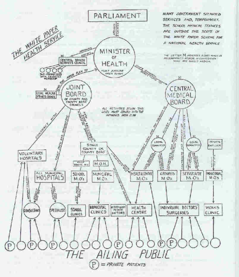
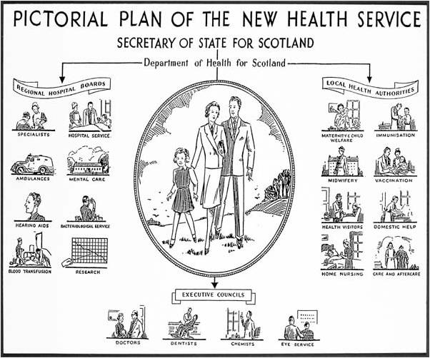
Even before the NHS was born, it was mapped by and for experts, politicians and the general public. The complex patchwork that made up pre-NHS health care provision (see our gallery here) is visible in diagrams like this one, produced by those seeking to educate workers about the services available to them. And the earliest charts of the NHS itself, intended for the eyes of experts and politicians alone, were pretty blunt about where power lay and how the new services would be administered and directed. Once the National Health Service Act committed the nation to the NHS, the Ministry of Health in England and Wales, the Northern Ireland Home and Health Service, and the Scottish Home and Health Department all began to generate their own charts and diagrams. So did local governments and other bodies. These charts were intended as much to advertise the new health services to their potential users as to provide useable information about the relationships between different parts of the NHS itself. Visually, these charts often placed the public at the centre of the visions of the NHS, or represented its complexity in terms they might recognise. One local authority portrayed the NHS as a modern high street, for example.
 Since these early days, many other bodies have also produced diagrams mapping the NHS for various reasons. Academics, including historians, have not been backward in this area. Indeed, some of the most famous charts of the NHS were produced by its official historian, Charles Webster, to explain policy-driven shifts in the structure of the NHS across its history.
Most recently, stakeholders of all kinds and descriptions, from local health authorities through to major think-tanks and political parties have produced their own organisational diagrams of the controversial changes prompted by the Health and Social Care Act of 2012.
As in the first years of the NHS, these vary markedly depending on whom they are intended to inform. Those addressing the public directly once again often place images of service users at the centre, while those intended for professionals or policy makers may offer a rather different vision. Political and ideological commitments, too, play a strong role in shaping depictions of the new NHS, whether pictorial or purely diagrammatic in nature. A chart produced by the Government as controversy raged over changes that faced strong opposition, looks pretty different from the one produced by those who strongly opposed the changes.
Meanwhile, medical professionals responding to and coping with a major re-organisation, often produce their own mental ‘maps’ of the new NHS, like the one illustrating this blog. Unlike the diagrams produced by each side of the debate, these are maps of the new system as it is experienced or expected to function. Like this one, many such maps are really images of how power, authority and decision making are distributed across a very complicated system, and as such are very individual, based on the specific perspective and position of their creators. The Socialist Health Association has created their own (animated!) organisational chart, at the bottom of the page here, which reflects their doubts about the new system. So has the King’s Fund, with a wonderful companion video, here, drawing and explaining the system.
What would your NHS map look like? Why not draw or describe it for us in the comments below (you can send us your own diagrams here)!
And what does all this mean for us, and for the NHS itself? Well, first, it shows us what a slippery and many-tentacled thing this ‘National Health Service’ really is: we all – experts and ordinary users alike – NEED maps, because providing universal services, free at the point of need, requires many different structures, providers, institutions and pathways. Second, these diagrams remind us that the NHS has never been a static, stable entity. These maps, charts and organisational diagrams are needed in part because the NHS has been reorganised and restructured so many times since its birth in 1948. Finally, they tell us that maps of the NHS, like all historical objects and documents, carry a wealth of meanings, and demand careful interpretation. In other words, even apparently simple and neutral charts have politics – and need to be treated as the ideological artefacts that they so often are.


