 As the excitement builds towards celebrating 70 years of the NHS, a hive of activity is emerging to highlight the importance of this national institution. Visibility has become a key watchword in such activities – media representations in documentaries, news and radio pieces, theatre productions and exhibitions, to mention but a few, are each determined to explore and represent what the NHS means to the British public.
The Science Museum in London has taken up this mantle with no less gusto, with a section of its new Medical Galleries to include a display relating to the history of the NHS. Though not focused on an opening for the anniversary per se, this project opens up important questions regarding how we represent the NHS visually, and it was with this in mind that I was invited to run a standalone 2-hour artist workshop with their steering committee. This, however, is no ordinary steering committee. Composed of group leaders and representatives for the public groups that the Science Museum is working closely with in order to produce the NHS display, including Homerton University Hospital, Adelaide Medical Centre, Watling Medical Centre and A.S.A Disability, the aim for the Museum is that public participation should be a key driver in producing the final NHS display. Short films have been proposed that will be produced by collaboration with these groups, through their stories, memories and ideas of what the NHS means and has meant, with examples of how this might be presented visually. But as any ad execs worth their salt would undoubtedly point out, user-generated content may be the gold dust of today’s media and creative economy, but it is equally difficult to negotiate and produce. This task is made even more tricky when the subject under discussion is suffused with ideas that depend on so many intangibles.But this task is made even more tricky when the subject under discussion – the NHS – is suffused with ideas that depend on so many intangibles. Compassion, inclusion, pride, levelling and security are just some of the values that we associate with the NHS that appear to prove more difficult to represent visually. As one participant put it: ‘you have your work cut out for you’.
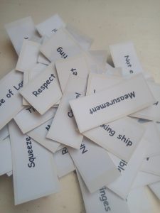
However, working from the material generated by participant interviews, and from photos that the participants were asked to send, representing their experiences and thoughts of the NHS, the group quickly ran full steam ahead. By the close of a very fast-flying 2 hours we were able to produce mood boards, images and ideas, that began to go some way to representing the NHS, and its complex network of meanings. ‘NHS word cards’ created from random selections from participant interviews were particularly successful, in which the team was split into groups and asked to create a ‘continuum’ using these words, having been asked to decide which words they most agree or disagree with when thinking about the NHS. The same cards were then used to create themes, and those themes were then used a starting-point, with the images sent in, for the mood boards.The activities were purposefully kept simple, with the workshop taking a much slower step-by-step approach than would otherwise be taken with a more experienced, practical art group, and the use of the usually (somewhat messy) materials I incorporate into workshops was inappropriate to the needs of the Museum and the setting.
The Museum will continue to work with the groups, as this is an ongoing collaboration for them that will take some time and dedication. However, as a standalone exercise there was much to be gained from this event, and not just for the Museum and the participants in moving forwards with the display. As I left the close of the session, that somewhat brutal, yet insightful, comment from a participant – ‘you have your work cut our for you’ – still rang in my ears. It left me wondering if it is indeed nigh on impossible to represent the NHS and its complex ideologies though static images or objects. Even in TV drama and film, we implicitly assume that the footage we see – an unfolding drama a&e drama, for example – is the NHS. We assume so unless decidedly told otherwise because the NHS, fundamentally, is medicine for almost all of us.
But more than this, I wondered, when it comes to trying to get to grips with the NHS and its meaning through exhibits, objects and images, are we stuck with either quite literal images that fall short of saying anything meaningful or with depth, or else a collection of visual symbols that most would need a doctorate in Art History to comprehend? Perhaps not. For one thing, there is indeed space for both the literal display– through say, the material culture of campaign banners and protest photographs – but also, and alongside it, the more metaphorical exploration. Indeed, representing ‘intangibles’ is what art, film and even museums, very often, do actually do. So it is perhaps the greater disservice to assume that the public would not have the appetite, or visual literacy, to engage with such displays. Indeed, in my previous research on abortion I wrote 80,000 words explaining how abortion has been used in literature to represent wider, existential concepts, and produced a recent article for Feminist Legal Studies discussing the same obstacles around visual encoding for abortion, but without resigning to ultimate ‘visual defeat’. The British public literacy around the NHS, in fact, was evident in responses to the 2012 Olympic Opening Ceremony. While many nations watched on in utter confusion at the amalgamation of children in hospital beds, fictional heroines and dancing nurses and healthcare staff, the British public knew exactly what all this meant: this was ‘our NHS’. The most invisible visible institution of them all.


